By Your Trading Mentor,
Trading Angel
WHAT IS ACTION TRADING?
Price Action trading is a form of technical analysis which looks at price rather than indicators. If you are brand new to forex trading then I understand that about three things in that first sentence might have confused you so let’s break it down. If you are worried that it sounds too complicated already, then keep reading, because price action trading is a very powerful form of technical analysis and it’s worth understanding
FUNDAMENTAL ANALYSIS VS TECHNICAL ANALYSIS
These are two main types of analysis which forex traders do to help them interpret the financial markets and decide whether they want to buy or sell.
Fundamental analysis looks at what’s going on in the world and technical analysis looks at what’s going on in the charts. Both are important! Fundamental analysis includes financial news releases and economical data such as interest rates decisions, central bank policy, inflation, unemployment rates etc How a country is doing economically is ultimately what moves the financial markets and determines the value of a currency. However, it’s also really important for forex traders to understand how the visual representation of this information on a chart is displayed and how it can be used to get good entries and exits on their trades.
TECHNICAL ANALYSIS IS THE ART OF READING THE CHART
Technical analysis includes price action (which we are doing a deep dive into in a bit) and it also includes technical indicators. Indicators are tools which are often based off lagging data which can be used to plot on the chart or to give us readings in order to help inform future trading decisions. These can help us to gauge aspects such as momentum or volatility, which are important for traders to understand if they are going to be trading a certain currency pair.
Price Action trading is a form of technical analysis which looks at price rather than indicators. That’s my very first sentence at the top of this blog post again but hopefully it makes more sense this time around.
Candlesticks are the visual representation of price on the financial markets charts. They show us the journey which the price has been on in a certain time period. And there are many ways you can use candlesticks and the patterns they produce in technical analysis. But just before we get into that, let’s quickly make sure we understand candlesticks first.
There are bullish candlesticks which move the market higher and close higher than they open, You would expect to see more of these in uptrends.
There are bearish candlesticks which move the market lower and close lower than they open. You would expect to see more of these in downtrends.
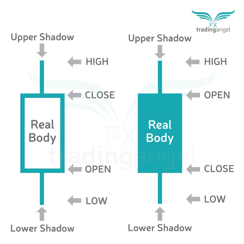
Candlesticks are made of the body and the wick and like regular household candles which you would use for burning, the body is the thick part and the wick is the thin part. The body shows you the open and the close and the wick shows you the extremes.
PRICE ACTION LOOKS AT PRICE AND TIME
Forex traders look at these candlesticks and the journey they have been on in a certain time period, to help them make decisions about market sentiment, where the price is likely to go next and also for precise entries and exits. This is price action trading. Ultimately price action is any action which is taken from price.
TYPES OF PRICE ACTION
CANDLESTICK SHAPES
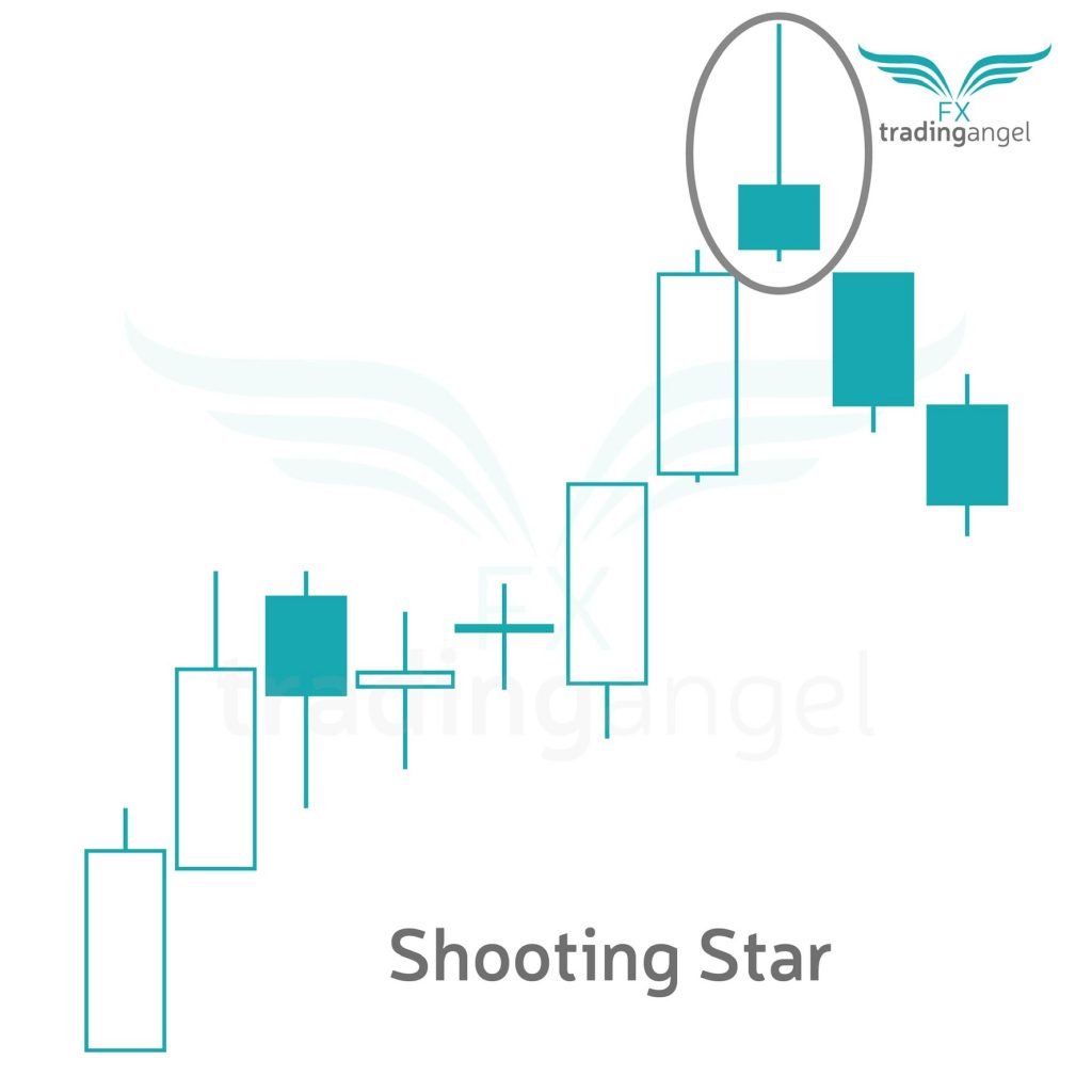
There are loads of different ways a single candlestick can give traders an idea of what the market sentiment is likely to be in the future. For example large bodies show certainty whereas small bodies and lots of wick on either side (these are called doji candles) can show uncertainty. Similarly a small body with lots of wick in one direction can show price rejection in that direction. For example, a shooting star candle at the top of an uptrend is a strong bearish indicator. A shooting star candle has a small body with a lot of wick at the top, its showing the price at the top has been rejected.
CANDLESTICK PATTERNS
There are loads of candlestick patterns which forex traders use to make buying and selling decisions before a trade. A candlestick pattern can be two candlesticks or more. A popular example of a candlestick pattern is an engulfing candle.You can get either bullish engulfing candles or bearish engulfing candles and these are just two candlesticks next to each other which have closed in opposite directions with the most recent one having a larger body than the first one. This is why it’s called engulfing as the second candle engulfs the first one. This candlestick pattern often signifies a move which is more likely in the direction of the second candlestick as the fact that the body is so much larger shows more certainty in that direction. For example if you had a bullish engulfing candle pattern that would mean you had a small bearish candle followed by a larger bullish candle and this would show that the buyers were more in control than the sellers and buyers might think the market is more likely to move upwards after this pattern. Alternatively a bearish engulfing candle would see a small bullish candle followed by a large bearish candle and buyers might interpret this as a possible move to the downside with the impression that the sellers were more in control than the buyers.
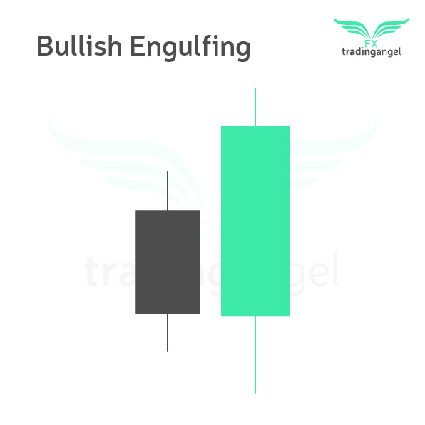
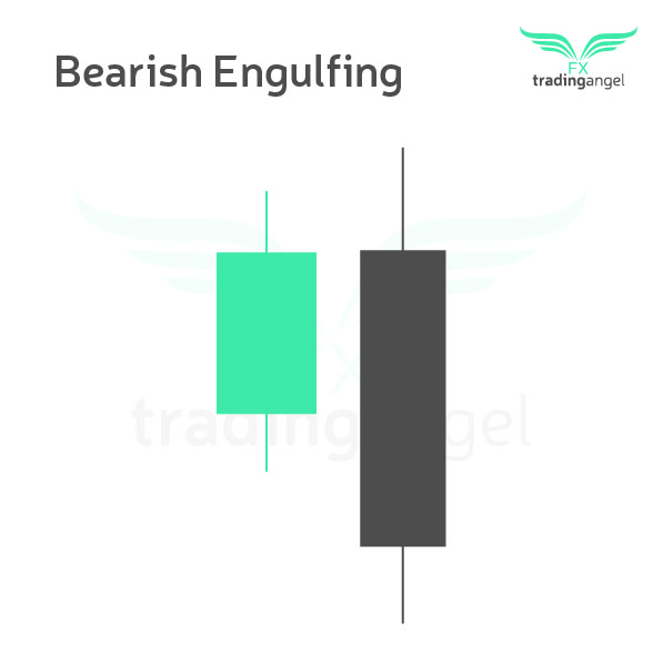
CHART PATTERNS
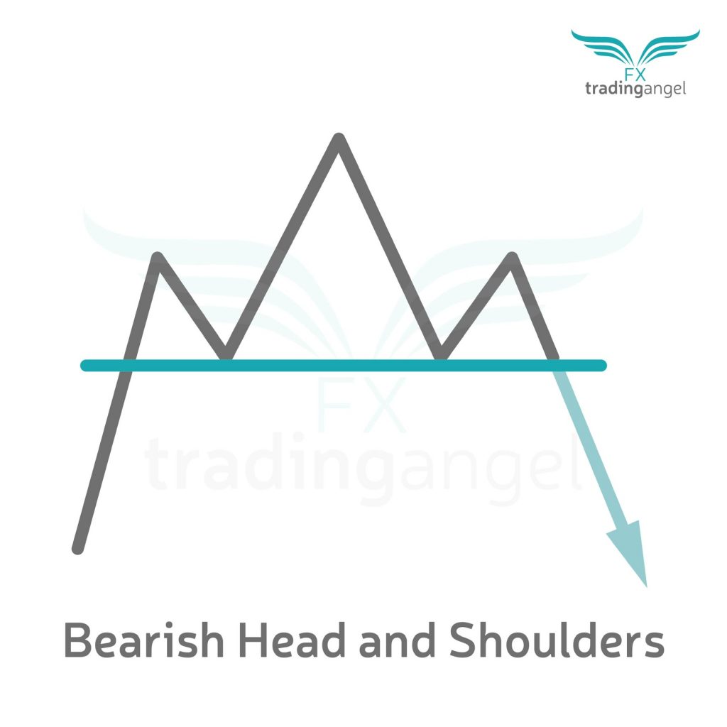
Chart patterns are lots of candlesticks over a long period of time which have formed patterns. Traders look at these patterns for signs that a market might move in a certain direction. An example of a chart pattern is the head and shoulders pattern. This has three peaks at the top of an uptrend with the central peak being higher than the two on either side. When traders see the head and shoulders pattern they take this as a bearish signal and often try looking for sell opportunities at the ‘neckline’. If it’s not obvious, it’s called a head and shoulders pattern because it looks like a head and shoulders – apparently!
SUPPORT AND RESISTANCE LEVELS
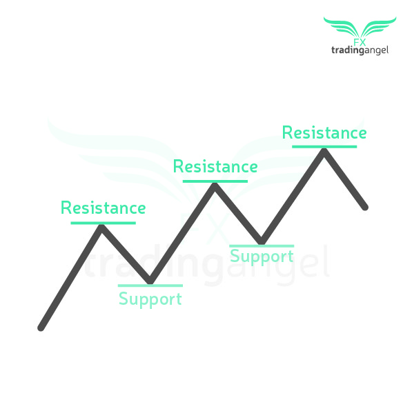
Support and resistance levels on a forex chart are lines which forex traders draw on to try and identify the areas of significance. Often these are highs and lows, where the market has reached and reversed previously. When traders identify support and resistance levels on a chart they can then look for signs that the market is either going to breakthrough that areas in which case they would trade in one direction, or if the market shows signs of reversal at the level then they would trade in the opposite direction. Support is the level which is below the candlesticks as it is ‘supporting’ them and resistance is the level which is above the candlesticks. Also they are interchangeable so what was once support can then become resistance and what was once resistance can become support. Think of support and resistance levels as being the floor and the ceiling of a house with many storeys. The floor is support and the ceiling is resistance. Once you climb the stairs to get to the second level, what was once the ceiling is now the floor. Or what was once resistance is now support.
SUPPLY AND DEMAND ZONES
Supply and demand zones are slightly more sophisticated forms of support and resistance. These are key zones which traders use to identify ares where lots of buying and selling is taking place. On TradingView the rectangle tool can be used to to plot on these areas and then forex traders look for possible trades if the prices enters and exits these zones according to their strategy. Supply is where traders look for sell positions and demand is where traders look for buy positions. SMC trading (which stands for Smart Money Concepts) is a very popular form of forex trading which was introduced by the trader who calls himself the “mentor to your mentor” (if you’re wondering he wasn’t my mentor but I do find his work interesting), ICT or Inner Circle Trading. I’m actually strongly considering taking his mentorship course so if you are interested in finding out how that goes make sure you subscirbe to this blog as I will obviously be keeping you updated.
TREND LINES
Trend lines are diagonal lines which traders draw on their forex charts which can help them make decisions as to whether they want to buy or to sell. If the market is moving down, making lower highs each time it makes a move up, then a trend line can be drawn across the highs of the candlesticks and it would be sloping in a downwards direction. A sudden move up with a long bodied candle breaking and closing above the trend line could signify to a forex trader that they want to start looking for buy positions, if the rest of the price action falls in line with their trading strategy.
CHANNEL LINES
Channel lines are similar to trend lines in that they are horizontal lines which are plotted on the chart, however there are two of them and the are parallel to each other. The price will be moving between the channel lines. So traders look for sell opportunities at the top of the channel lines and buy opportunities at the bottom of the channel lines and other traders look for candles to break the channel lines before getting into a trade.
PULL BACKS
Pullbacks are a normal part of price action. They are small moves in the opposite direction to the trend. When a market is moving in one direction, let’s say it’s in an uptrend for this example, it’s not just going to move with none stop bullish candles all the way to the top. There are going to be small bearish candlesticks all the way up the trend too. These can be the result of traders who are in long positions closing their trades and taking their profits. When a buy position is closed, it automatically opens a sell position which means that if enough traders are doing this at the same point you might see small dips. But other buyers might see this as a good point to enter into a buy position as they get a better price after a pull back. Looking for a pull back in the market followed by an engulfing candle is one of my favourite entries into a trend trade. This works for sell positions as well as buy positions.
BREAKOUTS
Breakouts are big explosive moves out of an area on the chart. Sometimes these can be areas of consolation where the market has been in a range and then a long bodied candle pushes the price out of that range. Or these can be breakouts from support or resistance levels or from channel lines. Traders enjoy trading breakouts as often the price moves fast in the direction of the break.
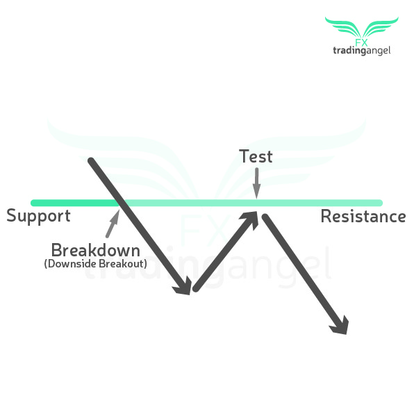
BREAK AND RE-TEST
But as trading isn’t straightforward you do sometimes get re-tests when a market breaks out which is why some traders don’t trade the break and often wait for the re-test instead. A re-test means that once the price has broken out of the area it was in, it actually retraces on itself and comes back to the area it broke from before moving in the direction of the break. So, for example ,if there was a resistance level which the price broke out of, this would mean a bullish candle closed above the resistance level. Rather than continuing to move higher, the market might then move back down to the previous resistance level which has now become a support level. Once it has tested this level it then moves back up. Some forex traders prefer to wait for the re-test after a break as it can sometimes offer a better price and also means you don’t have to take on so much risk as your stop loss can be closer to your entry point. When you trade the break itself, it’s always sensible to be aware that a re-test might take place, and if this happens you need to make sure that your stop loss is in a safe place below the level so that you don’t get stopped out and lose money on the re-test.
FAKE-OUTS
And if trading wasn’t difficult enough, sometimes the breakouts aren’t even real breakouts! Sometimes they are fake-outs! Which means that the price isn’t actually going to move in the direction of the break. In fact, fake outs can be a good sign of market rejection. So instead of the market moving in the direction of the break, if it’s a fake out they might actually start moving in the opposite direction instead. One trick which I think is pretty handy for distinguishing between a breakout and a fake-out is to use a higher time frame. If you are trading on a small time frame then you will see a lot of ‘breakouts’ when you switch to a higher time frame you will notice that the bodies of the candle are not actually closing above or below the levels but are actually just a wicky candle with wick pocking above or below and the body itself remaining in the area. Remember that wick can show us price rejection in price action. So if you see a lot of wick pocking above a level then this can be a good sign that it is actually a fake-out and not a breakout and this can be seen clearer on a higher time frame. When I trade breakouts I prefer to trade on 1H or above. The 4H time frame is actually my preferred time frame to trade on, however with breakouts I think it can be beneficial to go down to the 1H so that you don’t miss too much of the break and end up getting into the trade too late. Just don’t go any lower than the 1H as you might get too many false entries.
Remember, with breakouts that they do often move fast so it happens frequently that you do miss the move. If you are trying to keep across 28 currency pairs every day it’s very likely you will miss a trade or two. The good news is, once the break has happened you can then move to a smaller time frame to start looking for entries on pull backs just like I mentioned above! There are lots of transferable skills like this in trading!! If I’ve missed a breakout on the 1H chart I will often drop to the 15M time frame and then wait for at least a two candle pull back in the opposite direction to the trend followed by an engulfing candle in the direction of the trend.
So, now you know a lot about price action in forex trading!
If you want to learn more and see some examples of what I’ve talked about, then I recently made a YouTube video which is up on Trading Angel’s YouTube channel which goes into price action trading for beginners. You can watch that video here.
Happy Trading!
Love From, Your Trading Mentor x